This condominium was built in 1981 and updated prior to staging. The realtor wanted to appeal to two audiences: Baby Boomer clients looking for a condo to retire in and Millennials as first time homeowners. A Mid Century modern style of home staging was suggested to appeal to both target demographics. Some Baby Boomers were raised living in Mid Century Modern homes and some Millennials are currently obsessed with the design style influences, here, we meet in the middle.
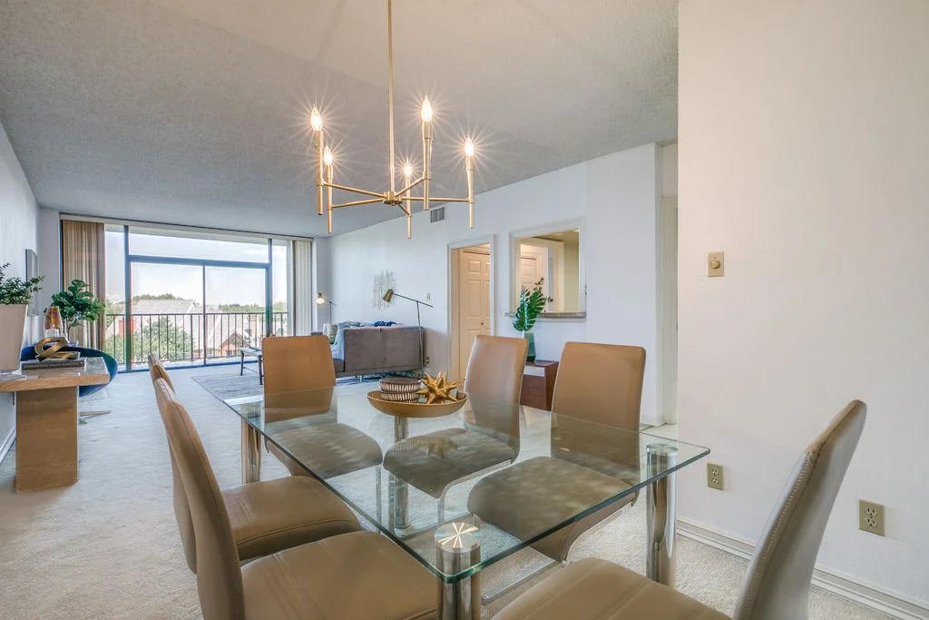
Before: The dining area featured the original 1980s, shiny brass light fixture, lots of clutter, and traditional furnishings. After: The dining space was updated with a modern brushed brass chandelier featuring straight lines and a more contemporary style. The clutter had been removed by the homeowner prior to staging day, which helped to physically and visually create more space in the room. In order to update the space with more contemporary furnishings and wall décor, the traditional furnishings have been completely replaced.
The condo’s layout features an open concept floor plan entryway, dining space, and living space. The staging style was a nod to the Mid Century design, so the flow of the style was very important, as there were no dividing walls between the living and dining spaces. The dining area features a modern chrome and glass dining table with curving chairs that create a dining space that is streamlined and modern.
Before: This beautiful marble console table belonged to the homeowner. Due to its unique nature, we asked for it not to be removed in order to repurpose in staging. After: As you can see, the console never moved from its location, while the wall décor was changed to modern wall art and the accessories were chosen to complement and fit the fresh aesthetic.
Before: Welcome to the 1980s! The curved sofa sectional, accessories, and oversized media cabinet in the living room dated the entire condo.
After: Originally in the entryway, the record player is perfect for the focal wall which fits the retro vibe we were trying to achieve. The oversized media cabinet previously on the feature wall visually took up a lot of space in the room. But now, the record player is more in scale with the room and the solid wood furniture brings in nature, along with the fiddle leaf fig. Since the spaces are close in relation, we made sure the style, artwork, colors, and metal tones flow through the areas.
Before: Such a supersized sofa closed off the space and didn’t fit proportionately on the wall. Furthermore, the lamps, rug, and accent chair were all antiquated.
After: To open up the space, this gray sectional was selected for its contemporary style with Mid-Century tapered legs and flanked with brass floor lamps. Above the sofa is a piece of iconic Mid Century Modern metal wall décor and the coffee table is nostalgic in feel. Clutter was completely removed, and the rug brought in some texture and hues of blue and orange into the space.
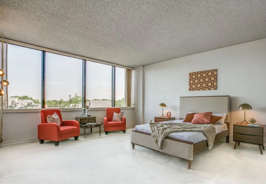
Before: This space included black bedroom furniture that was behind the times. The room was crowded with furniture and clutter plus, the shiny brass mirror and bedding were doing no favors for selling this space.
After: The after bedroom takes years off the condo and showcases the spaciousness of the room. The bed and nightstands are an instant modern update with a trendy mid-century flair. Retro bedroom vibes are created with a fabric headboard and simplistic bedding and solid oak wood nightstands complemented with cool brass lamps. Bold shapes and bold colors in the artwork tie the resting space together with the seating area.
The home staging helped achieve a retro inspired condo featuring simplicity with Mid Century Modern influences.


